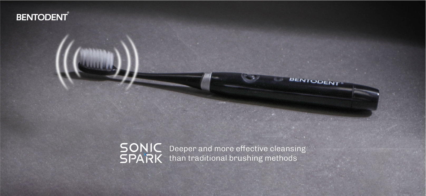
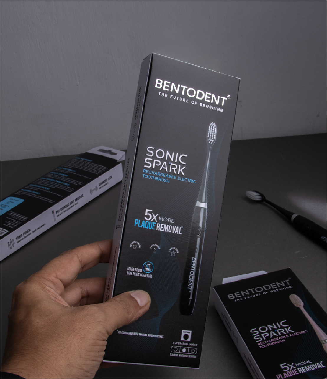
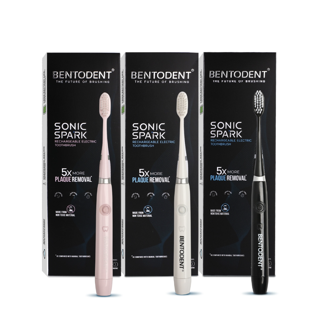
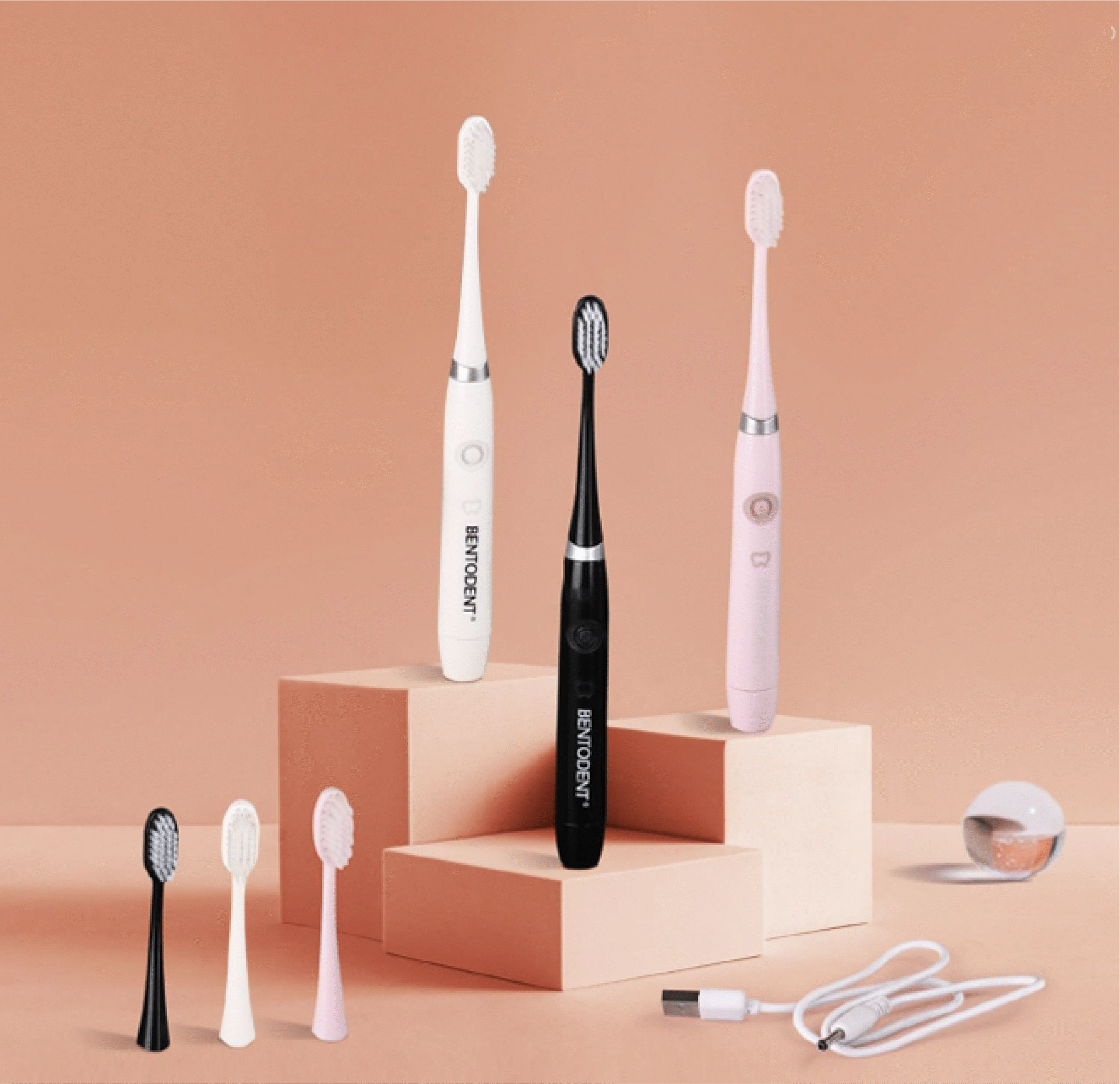
Bentodent’s entry into the ‘electric toothpaste’ space marked a bold shift. One that challenged existing perceptions of the brand as purely all-natural. It was unlike anything they had done before and required a careful, considered approach to creating content
abcdefghijklmnopqrstuvwxyz
0123456789
Aa
abcdefghijklmnopqrstuvwxyz
0123456789
Aa
The design needed to be as elegant and clean as possible. I chose a serif font that felt like one you’d see in a fashion newspaper, and plenty of negative space ensures that the pictures do not fight with each other for attention. I also used very muted colors to keep the focus on the saturated ones in Elena’s photos.
We build and activate brands through cultural insight, strategic vision, and the power of emotion across every element of its expression.