BRAND INDENTITY

No name. No identity. Just a category.

When the client approached us, all they had was a product line in the home and kitchen appliances space - and a desire to launch something that felt premium but grounded in reality.

The rest was our canvas to Create Better.

Client

Galaxy Digital Pvt. Ltd.

Services

Identity

Strategy

Positioning

Core Message

http://Saporo%20Logo

No brand. No name.
Just a mission.

Saporo didn’t exist. Not even as a name.

All the client had was a dream: to make everyday life simpler for the people who need it most - first-jobbers, working couples, single parents and students navigating life away from home.

So we did what good branding always does. We listened. And then we built.

A name that sticks.
A symbol that soars.

Saporo didn’t exist. Not even as a name.

All the client had was a dream: to make everyday life simpler for the people who need it most - first-jobbers, working couples, single parents and students navigating life away from home.

So we did what good branding always does. We listened. And then we built.

Typography

Blauer Nue

abcdefghijklmnopqrstuvwxyz

0123456789

Aa

Merriweather

abcdefghijklmnopqrstuvwxyz

0123456789

Aa

Colors

#ed7135 #f9eeda #adc0be

PREMIUM PACKAGING DESIGN

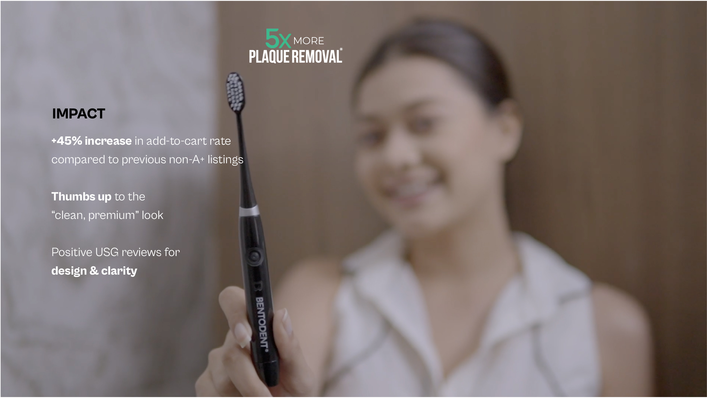
Electric Toothbrush Packaging
Electric toothbrush on podium

CLEAN PRODUCT CONTENT

BRAND INDENTITY

No name. No identity. Just a category.

When the client approached us, all they had was a product line in the home and kitchen appliances space - and a desire to launch something that felt premium but grounded in reality.

The rest was our canvas to Create Better.

Client

Galaxy Digital Pvt. Ltd.

Services

Identity

Strategy

Positioning

Core Message

http://Saporo%20Logo

No brand. No name.
Just a mission.

Saporo didn’t exist. Not even as a name.

All the client had was a dream: to make everyday life simpler for the people who need it most - first-jobbers, working couples, single parents and students navigating life away from home.

So we did what good branding always does. We listened. And then we built.

A name that sticks.
A symbol that soars.

Saporo didn’t exist. Not even as a name.

All the client had was a dream: to make everyday life simpler for the people who need it most - first-jobbers, working couples, single parents and students navigating life away from home.

So we did what good branding always does. We listened. And then we built.

Typography

Blauer Nue

abcdefghijklmnopqrstuvwxyz

0123456789

Aa

Merriweather

abcdefghijklmnopqrstuvwxyz

0123456789

Aa

Colors

#ed7135 #f9eeda #adc0be

PREMIUM PACKAGING DESIGN

Electric Toothbrush Packaging
Electric toothbrush on podium

CLEAN PRODUCT CONTENT